Senin, 30 Juni 2008
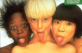
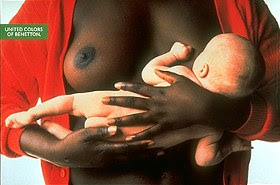
RESPECT(NO RACISM)...BENETTON BEEN DONE THAT!!!
Advertising as one of powerful media has main role in contemporary society. Moreover, the advertisement would give any influences to people. Sometimes people unconsciously act what advertisement asked, they work hard, save the money, and buy things. In other words, they do exactly what the advertiser has been told about.
In some advertisement, the advertiser uses particular of method to persuade people to do what they want in short and long time. On the other side, sometimes advertising industry use radical methods only for conservative reasons. It doesn’t matter if they use some kind of distraction whether they try to lead people perception to other things that are crucial such as, politics, social, or economics. At the end of the days, still what they looking for is get the income as much as they can.
It is negotiable that Benetton advertisement has a similar purpose particularly in consumer society. Even though, Benetton presents a different concept in terms of creativity and ideas. Furthermore, many people salute with the new concept of advertising that was offered by Benetton. However, what people saluted was the old order.
references:
Olivero toscani retrieved from http://www.ciadvertising.org/studies/student/98_fall/theory/blouin/toscani/toscani.html .march 28 2005
http://www.echeat.com/essay.php?t=25115
http://press.benettongroup.com/
FORMER JOB V.1 (MOTIONGRAPHICS)
History of motion graphic already began in 1950s. There was one designer that influenced motion graphic in film and television. He was Saul Bass.
"Design is thinking made visual" - Saul Bass
Bass revolutionized the design of film title sequences, beginning with Otto Preminger's Carmen Jones (1954). He pioneered the use of animation techniques to achieve a range of psychological and emotional effects unobtainable with conventional straight type. His collaborations with Preminger and Alfred Hitchcock were outstanding, particularly Vertigo (1958), Psycho (1960) and Bunny Lake Is Missing (1965).
Vertigo (1958) Spinning vortex credit design. North by Northwest (1959) Lines going up (north) and left (west) credit design. Psycho (1960) Lines symbolizing stabbing (knife) credit design, and shower murder design.
He also has been work with martin scorsese in god fellas, and casino. His works also inspired other designers such as kyle cooper, ian swift, and hilman curtis.
Development of graphic design has been increased rapidly. Followed by media which requires applied design from print out to broadcast design in television.
At first, applied design for broadcast only using still graphic for program title which composed in editing or post production. As a matter of fact, it only used simple movement. According to technology and demand, still graphic transformed in to motion graphics which is based on purposes.
A movement of graphics not only facilitates program wants with corporate standard or brand identity. Moreover, it also accommodates teenager need which combines with street design style, for instance MTV or Channel V which has young teenager as their target audience. Their style some times called breaking rule style or experiment style. In addition, web style that adapt motion graphic through tweening shape and motion style from macromedia Flash. For this kind of style there is Jordi Labanda one of illustrator which his style become a trend that has been used for opening movie “catch me if you can”.
THREE PRINCIPLES THAT DESIGNER SHOULD HAVE
- Regardless of the technology you choose – the hand or the computer- you must have good basic design sense.
- It helps enormously to be well informed about the kind of programming you choose to work.
- You should be willing, able, and even eager to work under severe deadline pressure.
- You should have a good relationship with cigarettes and coffee.
IMPROVING DESIGNERS SKILL
Many designers find difficulties to come up with new ideas. Indeed, they have to. Here are some tips from matthias zentner motion graphic designer from germany who founder velvet medien design (got from Melanie Goux & James A. Houff. (2003). On Screen in Time: Transition in Motion Graphic Design for Film, Television, and New Media, Switzerland: Rotovision.
- Make qualification for every piece of outgoing work, by standardizing a quality of the outputs.
- Try to maintain a passion for the work in any other circumstances. Sometimes, deadline could be something frightening which could affect moodiness of graphic artists.
- Practice to criticize the works which means accept people critics about their works.
- Try to ignoring trends; show the ideas and having courage to state that the ideas are high-quality and genuine.
- Try to avoid redundancy. If the graphic artists do something that has been done before, they are not creative otherwise being redundant (DeHarak, 1987)
On the other side, it is believed that by joining some unions the graphic artists would have a better life in terms of welfare. As Blanksteen and Odeni (1987, p. 221) mention, ‘unions aren’t bad thing. Some rules, originally designed to protect members from management abuses, can interfere with the smooth running of the operation’. There are several unions that the graphic artists could join, such as Broadcast Design Association (Anonymous, 2005) which was established twenty five years ago. Furthermore, BDA was also holding a PROMAX which is an annual design competition and conference in eight major cities through the world (Goux and Houf. 2003). Through this channel, the graphic artists would know what the trend of today’s design, and also could measure their skill comparing with any other graphic artists around the world. In one point, by joining the unions the graphic artist would have some benefits such as, job security, higher salaries, paid over-times, and extra pay over (Blanksteen and Odeni, 1987).
Rabu, 18 Juni 2008
MULTIMEDIA SHOW V.1
kalo boleh saya memberikan judul untuk artike yang satu ini....kenapa di bilang multimedia karena pertunjukan ini menggabungkan berbagai macam media, mulai dari panggung, air, fireworks, performance, musik, pyro effect, laser, yang di dalamnya berisi berbagai macam image, bentuk, simbol...etc.
Bellagio hotel water show, adalah salah satunya...yang menggabungkan water show, lighting, dan music, yang menjadi pertunjukan yg menarik untuk di lihat. Saking menariknya (menjadi daya tarik utama di vegas strip) sampe sampe pertunjukan ini dijadikan set di film motion eleven(eh...ocean eleven)
pertama yang saya alami adalah fantasmic di disney MGM, yang menurut saya gila banget!!!(sampe bela2in nonton 2 kali:D)amaze!!! bagaimana mereka dengan halus memproyeksikan visual graphics dan video ke air/water sebagai screennya. ketepatan waktu antara performance, audio, fireworks, api, dan musik, membuat fantasmic its a must to see!!!.
Ketika sedang melakukan research untuk show yang akan di buat, saya menemukan show yang sejenis dan tidak kalah dengan fantasmic, dan tidak jauh dari asia tenggara adalah Song of the Sea, yang bisa di lihat di Sentosa Island di Singapura.
bisa juga untuk melihat shownya link di bawah ini:
http://www.youtube.com/watch?v=RFYJ8L6GRmQ
Ternyata di las vegas sana ada yang lebih parah, yaitu pertunjukan Lake of Dreams di hotel Wynn, Las Vegas....penggabungan dari semua media dengan space yang tidak terlalu besar, tetapi menggunakan screen air setinggi 40 feet ato sekitar 12 meter lebih. mereka juga menggunakan teknologi Color Kinetics’ intelligent solid-state lighting systems (susah beeng namanya)...tapi intinya mereka menggunakan lampu c-splash 2, yaitu lampu yang super tipis yang bisa tahan air (air tawar ato air asin) sampai kedalaman 3 meter (http://www.colorkinetics.com/ls/rgb/csplash2/), yang tidak kalah serunya adalah untuk mengisi content visual imagenya, mereka berkerja sama dengan rumah produksi Imaginary Forces (www.imagineryforces.com), salah satu rumah produksi favourite saya...mungkin kalo berkecimpung di dunia motiongraphic akan lebih tauk siapa2 mereka (mereka yang membuat opening title film seven, salah satunya).
cuplikan video si lake of dreams ini bisa di lihat di:
(http://imaginaryforces.com/featured/3/325),
Selasa, 17 Juni 2008
X-FILES CONSPIRACY V.1
Kamis, 12 Juni 2008
FREITAG NEWS V.1
Rabu, 11 Juni 2008
SCOOTER PTS V.1
sori bukan mau ngebahas iklannya....cuma mau bahas motornya....:D
terimakasih buat tomociens untuk picnya....ini mirip banget ama motor gw yg lagi gw cat....pts 90cc, persenelingnya cuma 3....di produksi cuma buat cewek (coba liat gambar iklannya...cewek khan?)....kalo sekarang mio kali ye....tipis banget kalo dari belakang, ngebreak persepsi kalo vespa kudu semok...nanti kalo motor gw dah beres gw post d sini....wwwiiiiiggghhhhhhhhh......keren bangetttttt!!!!!
Selasa, 10 Juni 2008
STUDIO CENTRAL V.1
Apa yang anda tahu tentang digital print(banner, billboard, etc).....persis hanya untuk kebutuhan outdoor yg biasanya untuk promosi yang imagenya benar benar 2D (dua dimensi). Contoh ini membuat saya mengubah cara pandang saya tentang digital print(murah, meriah, wuookeeebanget). Ketika mengambil foto ini(obvious banget tasnya..:D), saya berpikir...gimana caranya bisa membuat background yang dibelakang(background yah d belakang mas...:D) benar2 terlihat real, dan masuk akal dari berbagai macam perspective. saya coba pelajari selama kurang lebih sebulan gimana caranya, dan gimana kok bisa yah....
Ternyata besar dan tinggi memberikan effect 'grand' yang okeh....baiklah kita tambah ingredient itu....ck..rcck...
according to this case...dengan menggabungkan 2 pakem ilmu (architect, dan graphics design)dan sedikit ini itu dari ilmu lain, kita dapat membuat apapun itu secara real....sebener benernya real....dan kita tidak membutuhkan space yang besar.....percayalah!!!
Ternyata besar dan tinggi memberikan effect 'grand' yang okeh....baiklah kita tambah ingredient itu....ck..rcck...
Disney MGM, Orlando
Ketika saya jalan memutar untuk cuma pengen tauk aja belakangnya kayak apa....ternyata, even its only 2D, mereka butuh konstruksi yang rada njelimet juga ye....secara mereka gunakan di luar ruangan....tp tenang, yang akan saya buat untuk dalam ruangan....gak kena angin atopun cuaca lain.....kasarnya kalo digital printnya di tempel d atas multiplex...toh oke2 aja. yang penting how to executenya!!!
first draft
setelah melewati 'sedikit' revisi ini adalah final, kita tinggal execute model 1:1.its only draft, di buat hanya sejam sebelum miting progress....n guess what? they(my bosses) liked it very much....how come (wonderin...:D)....so what the heck....lets move on to the model.
according to this case...dengan menggabungkan 2 pakem ilmu (architect, dan graphics design)dan sedikit ini itu dari ilmu lain, kita dapat membuat apapun itu secara real....sebener benernya real....dan kita tidak membutuhkan space yang besar.....percayalah!!!
TOON CITY V.3
ini fascade untuk keluar dari kids studio, yang berisi merchandise, kita namakan city library...
TOON CITY V.1
ini adalah first draft saya selama hampir 2 tahun di studio ini(ngapain aja dari awal:D), dari skecth awal, di buat model 1:25 dan akan di execute 1:1....(picnya untuk 1:1 menyusul mid 2009:D)
Langganan:
Postingan (Atom)